What should you know about melt curves in real-time PCR?
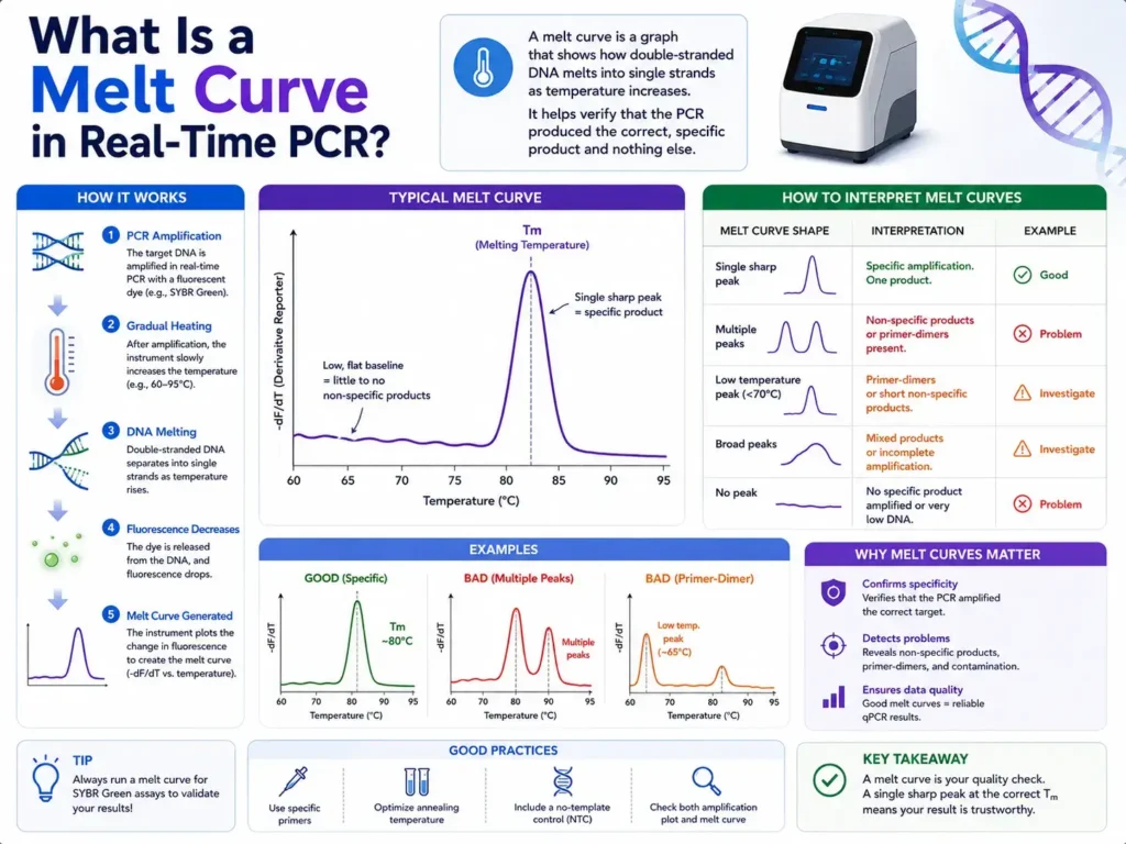
A melt curve in real-time PCR is a post-amplification check that helps show whether your qPCR reaction produced one clean DNA product or a mixture of products. After PCR amplification, the instrument slowly heats the reaction. As the double-stranded DNA separates into single strands, the fluorescent signal drops. The software turns that drop into a peak, and the temperature at the peak is called the melting temperature, or Tm.
A melt curve tells you how specific your real-time PCR reaction was. A clean SYBR Green qPCR assay usually gives one sharp peak. Extra peaks, shoulders, or low-temperature peaks often point toward primer-dimers, nonspecific products, or messy amplification. That small curve at the end of the run can save a whole experiment from being misread, especially when gene expression data looks “perfect” but the product behind it is not.
What does melt curve mean in real-time PCR?
A melt curve is a graph created after the amplification stage of real-time PCR to check the identity and purity of the PCR product. It shows how amplified double-stranded DNA melts as temperature rises.
In real-time PCR, especially SYBR Green-based qPCR, the fluorescent dye binds to double-stranded DNA. During amplification, fluorescence rises because more double-stranded DNA is being made. After amplification ends, the instrument increases the temperature step by step.
At lower temperatures, the PCR product remains double-stranded, so fluorescence stays high. As the temperature rises, the DNA strands begin to separate. Once the product melts, the dye can no longer bind in the same way, and fluorescence drops.
The software records that change and creates a melt curve. Many instruments also show a derivative melt curve, where the largest drop in fluorescence appears as a peak. That peak marks the melting temperature, usually called Tm.
Melt curve analysis is often used with SYBR Green assays because SYBR Green binds to any double-stranded DNA, not only the intended target. That includes the correct amplicon, nonspecific amplicons, and primer-dimers. Melt curve analysis helps separate those possibilities after the run.
Why is melt curve analysis used after qPCR?
Melt curve analysis is used after qPCR to check whether the fluorescence signal came from the correct PCR product. It helps catch nonspecific amplification that Ct values alone may not reveal.
A Ct or Cq value tells you when fluorescence crossed a threshold. It does not prove that the fluorescence came from the right target.
That is the catch many beginners miss.
A sample can show a nice amplification curve and still contain the wrong product. A primer-dimer can also produce fluorescence in SYBR Green assays because it is double-stranded DNA. If you only look at Ct values, you may accept weak or false signals as real gene expression.
Melt curve analysis adds a specificity check. A single, sharp peak at the expected Tm usually suggests one main PCR product. Multiple peaks suggest more than one product. A low-temperature peak often suggests primer-dimer formation because shorter DNA fragments tend to melt at lower temperatures than longer target amplicons.
How does a melt curve work in real-time PCR?
A melt curve works by slowly heating the completed qPCR reaction and measuring the loss of fluorescence as double-stranded DNA separates. Each DNA product melts at a characteristic temperature based on its sequence and length.
The process usually happens after the last PCR cycle. The instrument may raise the temperature from around 60°C to 95°C, depending on the protocol and chemistry. During that ramp, fluorescence is measured repeatedly.
When the DNA is still double-stranded, the fluorescent dye gives a strong signal. When the DNA strands separate, the signal falls. The software then plots fluorescence against temperature.
The raw melt curve often looks like a downward slope. The derivative plot converts that slope into a peak, which is easier to read. The top of the peak is the Tm.
A product with higher GC content usually melts at a higher temperature because G-C base pairs have three hydrogen bonds, while A-T base pairs have two. Longer amplicons also tend to melt at higher temperatures, although sequence composition plays a major role.
So, a melt curve is not just a random line at the end of the run. It is a thermal fingerprint of the amplified DNA.
What does Tm mean in a melt curve?
Tm means melting temperature. It is the temperature where the PCR product shows its strongest melting change, usually seen as the peak of the derivative melt curve.
In simple words, Tm is the point where the double-stranded PCR product is coming apart most rapidly.
Each PCR product has its own melting behavior. Two products with different sequence, length, or GC content can melt at different temperatures. That is why melt curve analysis can help identify whether a reaction made one product or several.
A single amplicon should usually produce one main Tm peak under the same reaction conditions. Small Tm changes between runs can happen because of salt concentration, dye chemistry, ramp rate, instrument settings, and master mix composition.
Large or inconsistent Tm changes need attention. They may suggest poor pipetting, mixed products, contamination, primer issues, or different reaction chemistry between plates.
What does a normal melt curve look like?
A normal melt curve usually has one sharp, narrow peak at the expected melting temperature. That pattern suggests the reaction produced one main PCR product.
In a clean SYBR Green qPCR assay, the melt curve should not show extra peaks, wide shoulders, or strong low-temperature signals. Many assay design guides describe a well-performing SYBR Green assay as one that gives a single melt peak, often matching a single band on an agarose gel.
A clean melt peak has three common features.
It appears at the expected Tm.
It is sharp rather than broad.
It appears consistently across true positive replicates.
Still, a single peak does not prove everything by itself. Two products can sometimes have similar melting behavior. For high-stakes work, researchers may confirm product size on a gel or sequence the amplicon, especially when designing a new assay. Studies using SYBR Green qPCR often pair melt curve analysis with gel electrophoresis or sequencing to confirm specificity.
What do multiple peaks in a melt curve mean?
Multiple peaks in a melt curve usually mean the reaction produced more than one double-stranded DNA product. These may include the target product, nonspecific amplicons, primer-dimers, or contamination.
This is one of the most common qPCR troubleshooting signs.
If your melt curve shows two peaks, one peak may represent the correct product while the other represents an unwanted product. The lower-temperature peak is often linked with primer-dimers, especially when it also appears in the no-template control.
A higher or similar-temperature extra peak may point to nonspecific amplification. That can happen when primers bind to a related sequence, genomic DNA contamination is present, or annealing temperature is too low.
The main risk is simple: your Ct value may no longer reflect only the target. It may reflect a mixture of products. That can distort gene expression results, copy number estimates, or pathogen detection calls.
What does a primer-dimer melt peak look like?
A primer-dimer melt peak often appears as a smaller peak at a lower temperature than the expected target amplicon. It may also appear in no-template controls.
Primer-dimers form when primers bind to each other instead of the target sequence. DNA polymerase can extend those primer-bound structures, creating short double-stranded products.
Because primer-dimers are usually short, they often melt earlier than the target amplicon. In derivative melt plots, they may show as a low-temperature peak before the main product peak. Technical examples of melt curve analysis often show primer-dimer peaks at lower temperatures than the intended PCR product.
Primer-dimers are not always harmless. In late cycles, they can create fluorescence and may appear as false amplification, especially in weak samples or no-template controls.
A small primer-dimer peak in a strong positive sample may not always ruin the run, but primer-dimer peaks in negative controls are a warning sign. They show that the assay can produce signal without template.
Why is melt curve analysis mostly linked with SYBR Green qPCR?
Melt curve analysis is mostly linked with SYBR Green qPCR because SYBR Green detects any double-stranded DNA. It cannot tell the correct target apart from primer-dimers or nonspecific products during amplification.
Probe-based assays, such as TaqMan qPCR, add another layer of specificity because the probe must bind to the target region for signal generation. SYBR Green is simpler and often cheaper, but it needs stronger post-run checking.
SYBR Green binds double-stranded DNA and produces fluorescence. That is helpful because it makes qPCR accessible and flexible, but it also creates a blind spot. The dye does not “know” whether the DNA came from the gene of interest or from an unwanted side reaction.
Melt curve analysis helps close that gap.
It gives the user a way to ask, “Was the amplified DNA likely one clean product?” In routine gene expression work, that question is not optional. A clean amplification curve without a clean melt curve can still be misleading.
Is melt curve analysis needed for TaqMan qPCR?
Melt curve analysis is usually not required for standard TaqMan qPCR because detection depends on a target-specific probe. Still, assay specificity should still be checked during assay design and setup.
TaqMan assays use primers plus a fluorescent probe. The probe adds specificity because fluorescence depends on probe binding and cleavage during amplification. That reduces the chance that random double-stranded DNA will create signal.
SYBR Green assays rely on dye binding, so melt curve analysis is a routine part of quality checking.
Some probe-based systems can use melt analysis in special applications, such as genotyping or mutation scanning, but that is different from the usual SYBR Green melt curve check after qPCR.
So, in everyday real-time PCR language, when people say “melt curve,” they are usually talking about SYBR Green or another DNA-binding dye assay.
How do you interpret melt curve results?
Melt curve results are interpreted by checking the number, shape, and temperature of peaks. One consistent peak near the expected Tm usually supports specific amplification, while extra peaks suggest unwanted products.
Start with the positive samples. If all true positives show one clear peak at the same Tm, the assay looks cleaner.
Then check the no-template control. A no-template control should ideally show no amplification and no meaningful melt peak. A low-temperature peak in the no-template control often points toward primer-dimers.
Next, compare replicates. Replicates should have matching melt peaks. If one replicate has a different peak, that well may have pipetting error, contamination, evaporation, or poor amplification.
The interpretation is strongest when melt curve data agrees with the amplification curve, controls, expected product size, and assay history. Melt curves are powerful, but they are not magic. They are one layer of evidence in the qPCR quality check.
What does a broad melt curve peak mean?
A broad melt curve peak usually suggests mixed products, poor assay specificity, uneven reaction conditions, or an amplicon with complex melting behavior.
A clean amplicon often gives a narrow peak. A broad peak may happen when several similar products melt across a wider temperature range. It can also happen when the reaction chemistry is inconsistent, the template is poor quality, or the product contains regions that melt in stages.
Broad peaks can also appear with longer amplicons because longer DNA fragments may have melting domains instead of one clean melting event. In qPCR, shorter amplicons are often preferred partly because they tend to amplify more reliably and can produce cleaner melt behavior.
If the peak is broad but consistent and the product has already been confirmed by gel or sequencing, it may be acceptable. If it is new, inconsistent, or paired with weak amplification, it deserves troubleshooting.
What does no melt peak mean after qPCR?
No melt peak usually means no detectable double-stranded PCR product was produced, or the fluorescence signal was too weak for the instrument to detect a clear melting event.
If the amplification curve also shows no signal, the reaction likely failed or the target was absent.
If amplification appears positive but no melt peak appears, check the analysis settings, dye selection, melt curve program, and instrument setup. Sometimes the run was programmed without proper melt acquisition. In other cases, the signal may be too low or noisy.
No melt peak in a no-template control is good.
No melt peak in a positive control is a problem.
A positive control should amplify and produce the expected melt peak. If it does not, the issue may be degraded template, wrong cycling conditions, missing reagent, failed reverse transcription, or instrument setup error.
What causes abnormal melt curves in real-time PCR?
Abnormal melt curves can come from primer-dimers, nonspecific amplification, contamination, poor primer design, low annealing temperature, degraded template, wrong reagent setup, or inconsistent pipetting.
Primer design is often the first place to look. Primers that bind to each other or bind multiple genomic regions can produce messy melt profiles. qPCR primer design work has also shown that melt curve analysis has limits, especially because dye behavior and reaction conditions can affect the signal.
Annealing temperature is another common cause. If the annealing temperature is too low, primers may bind imperfectly to unintended sequences. Raising the annealing temperature by a few degrees can sometimes clean up extra peaks.
Magnesium concentration, primer concentration, template amount, and master mix choice can also change the result. Too much primer may raise the chance of primer-dimer formation. Too much template may increase nonspecific amplification or carry inhibitors into the reaction.
Poor sample quality can add noise too. RNA degradation, genomic DNA contamination, phenol carryover, ethanol carryover, or low purity can all affect qPCR behavior.
How can you fix multiple peaks in a melt curve?
Multiple melt peaks can often be reduced by improving primer design, raising annealing temperature, lowering primer concentration, checking template quality, and confirming the amplicon by gel or sequencing.
A practical fix usually starts with the easiest changes.
Raise the annealing temperature slightly and run a gradient if your instrument allows it. A higher annealing temperature can reduce weak off-target primer binding.
Lower primer concentration if primer-dimers are visible, especially in no-template controls. Many qPCR assays use primer concentrations around 200–500 nM, but the best amount depends on the assay.
Redesign primers if the same problem keeps returning. Choose primers with clean predicted specificity, balanced Tm, limited self-complementarity, and an amplicon length suitable for qPCR.
Check the no-template control and no-reverse-transcription control. If the no-template control has a peak, contamination or primer-dimers may be present. If the no-RT control amplifies, genomic DNA contamination may be affecting the result.
Confirm the product when the assay is new. Gel electrophoresis can show whether the product size matches expectation. Sequencing can confirm identity when accuracy demands more confidence.
Can a melt curve confirm gene expression?
A melt curve cannot confirm gene expression by itself. It only supports whether the qPCR product appears specific. Gene expression interpretation also needs proper RNA quality, reverse transcription controls, reference genes, efficiency checks, and clean experimental design.
This distinction matters in real lab work.
A melt curve can tell you that one product was likely amplified. It cannot tell you whether the RNA sample was good, whether the reverse transcription step worked equally across samples, or whether the reference gene was stable.
For gene expression studies, melt curve analysis is one quality checkpoint. It works alongside amplification efficiency, replicate agreement, control wells, standard curves if used, and proper normalization.
A clean melt curve gives more confidence in the Ct value. It does not rescue a poorly planned experiment.
What is the difference between amplification curve and melt curve?
An amplification curve shows how fluorescence increases during PCR cycling. A melt curve shows how the final PCR product loses fluorescence as temperature rises after amplification.
The amplification curve answers: Did the reaction produce detectable signal, and when did it cross the threshold?
The melt curve answers: What kind of product likely produced that signal?
Both are needed in SYBR Green qPCR.
A sample may have a strong amplification curve and a poor melt curve. That suggests the reaction produced DNA, but not necessarily the intended DNA. A sample may also show late weak amplification with a low-temperature melt peak, which often points toward primer-dimer rather than true target detection.
Reading both curves together gives a much safer interpretation than reading either one alone.
What is the difference between melt curve and dissociation curve?
Melt curve and dissociation curve usually mean the same thing in real-time PCR. Both describe the melting of double-stranded DNA into single strands as temperature increases.
Some instruments call the post-PCR analysis a melt curve. Others call it a dissociation curve. The idea is the same: DNA strands separate, dye signal drops, and the software plots the change.
The term “dissociation curve” is common in some Applied Biosystems-style software, while “melt curve” is widely used across qPCR platforms.
A researcher reading either term should think of the same quality check: a post-amplification thermal profile of the PCR product.
What temperature range is used for melt curve analysis?
Many qPCR melt curve programs run from about 60°C to 95°C, although the exact range depends on the assay, instrument, dye, and expected amplicon Tm.
A typical SYBR Green melt curve starts below the expected product Tm and ends high enough to melt the product fully. Some published SYBR Green RT-qPCR workflows record fluorescence while raising the temperature from 65°C to 95°C in small increments.
The ramp rate can affect peak shape. A slower ramp can give better resolution between products with close Tm values. A faster ramp may save time but can make subtle differences harder to see.
The best range is one that captures the full melting behavior of the expected product and any possible lower-temperature primer-dimer signal.
Why does the same target sometimes show a different Tm?
The same target can show a different Tm when reaction chemistry, salt concentration, dye type, instrument settings, ramp rate, amplicon sequence, or sample quality changes.
Even small changes in master mix can move the melt peak. Different qPCR mixes may contain different salts, enhancers, dyes, and polymerases. These can affect melting behavior.
Instrument differences can also play a role. Temperature calibration and data acquisition settings are not always identical across platforms.
A tiny shift, such as 0.2°C to 0.5°C, may be normal in many workflows. A larger shift should be checked, especially if it appears in only some wells or only some samples.
Consistency matters more than chasing a universal Tm number. The expected Tm should be established under your own assay conditions.
Is one melt peak always proof of a correct product?
One melt peak is a good sign, but it is not absolute proof of the correct product. Two different DNA products can sometimes melt at similar temperatures.
This is the quiet limitation of melt curve analysis.
A single peak suggests one dominant product, but it does not directly show the product size or sequence. A wrong amplicon with a similar Tm may pass the melt curve check.
That is why new assays are often checked with gel electrophoresis, sequencing, or both. Once an assay has been confirmed and behaves consistently, routine melt curve checks become more useful for ongoing quality control.
Think of the melt curve as a warning system, not a full identity test.
What should you report about melt curves in qPCR results?
qPCR reporting should include whether melt curve analysis was performed, whether a single product was observed, and how specificity was checked for new assays.
Useful reporting details may include the melt curve temperature range, ramp rate if relevant, expected Tm, observed peak pattern, primer information, and control results.
If extra peaks appeared and wells were excluded, say so clearly. If product identity was confirmed by gel or sequencing, include that information too.
Transparent reporting helps other researchers judge whether the qPCR data are reliable. MIQE-style reporting was created for that reason: to make qPCR experiments easier to judge, repeat, and compare across labs.
A melt curve is a small graph that can protect the whole qPCR result
A melt curve in real-time PCR is more than a final software screen. It is a reality check. It tells you whether your SYBR Green signal likely came from one clean product or from a mixture of target DNA, primer-dimers, and unwanted amplification.
The best melt curve is usually simple: one sharp peak, in the expected place, repeated across true positives, with clean negative controls.
When the curve looks messy, the answer is not to ignore it. The answer is to slow down and check the assay. qPCR can produce beautiful numbers from poor reactions, and melt curve analysis is one of the easiest ways to catch that before the data turns into a wrong story.