How to Read PCR Curves: A Practical Guide to Ct Values, Amplification Plots, Melt Curves, and Strange Results
PCR curves can look confusing at first, especially when one sample rises early, another rises late, and a control gives a tiny signal you did not expect. A good PCR curve usually has a quiet baseline, a clean exponential rise, and a plateau. In real-time PCR, the cycle where the curve crosses the threshold gives the Ct or Cq value, and that value reflects how much starting target was present in the reaction. Lower Ct usually means more starting target. Higher Ct usually means less starting target.
The curve is not just a line on a screen. It is a story about template amount, primer behavior, reaction quality, contamination risk, and data reliability. A clean curve can give confidence. A messy curve can save you from trusting a bad result.
What does a PCR curve show?
A PCR curve shows how much DNA signal appears during each PCR cycle. In real-time PCR or qPCR, fluorescence is measured as the target sequence is copied, so the curve gives a live view of amplification instead of only an end-point result on a gel.
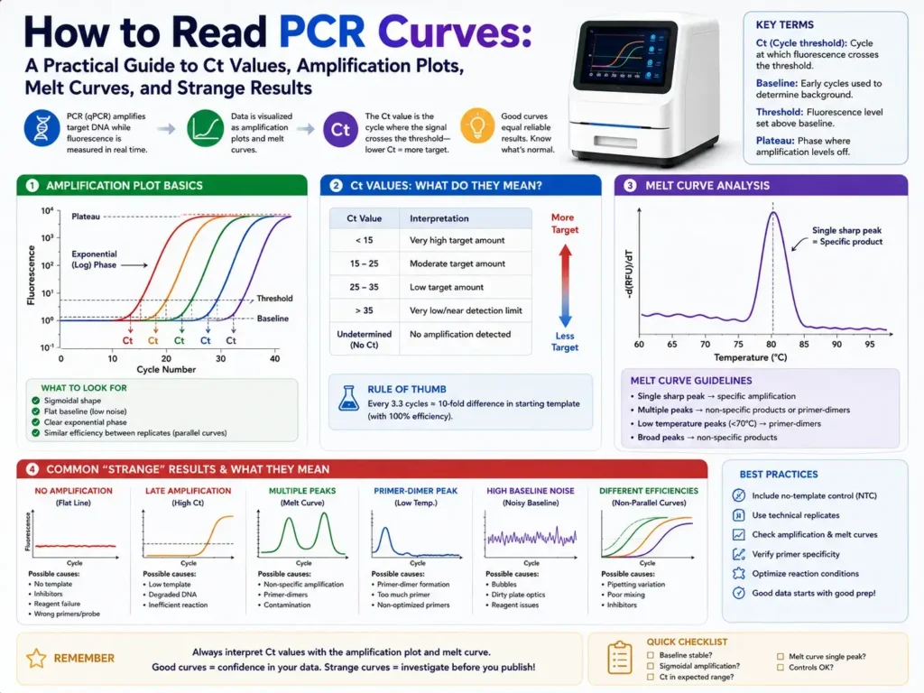
Most qPCR amplification plots have three main parts: baseline, exponential rise, and plateau. The baseline is the early low-signal area, the exponential phase is where product grows rapidly, and the plateau appears when the reaction begins to run out of active reagents or slows down. This three-phase shape is a normal pattern for a well-behaved amplification curve.
In a clean reaction, the curve stays flat at first. Then it rises in a smooth S-shape. Near the end, it flattens again. That shape tells you the reaction started quietly, amplified the target, and reached a limit.
A curve that starts rising too early, jumps around, never plateaus, or appears in the no-template control needs closer checking. The curve is often the first warning that something in the assay, sample, or plate setup is not right.
What are the main parts of a PCR amplification curve?
A PCR amplification curve has four practical areas: baseline, threshold, exponential phase, and plateau. Each area tells you something different about the reaction, and all four should be checked before trusting the Ct value.
Baseline
The baseline is the early part of the PCR run where fluorescence is still close to background. During these first cycles, the machine may detect small signal changes, but the true amplified product is not yet strong enough to stand apart from background fluorescence.
The baseline helps the software judge where background ends and real amplification begins. If the baseline is set poorly, the Ct value may move earlier or later than it should. Baseline handling is one reason two software packages can sometimes give slightly different Ct values from the same raw data.
Good baseline behavior looks quiet and steady. A noisy baseline can come from bubbles, poor sealing, evaporation, dirty wells, degraded dye, or a reaction mix that was not evenly prepared.
Threshold
The threshold is the fluorescence level used to call the Ct or Cq value. It should sit above background noise and within the exponential phase of amplification, not too low in the baseline and not too high near the plateau.
When the amplification curve crosses the threshold, the software records the Ct value. A threshold placed too low may catch noise. A threshold placed too high may push Ct values later and reduce the value of comparing samples.
Automatic thresholds are useful, but they are not perfect. Manual review is still needed, especially when the curves look odd, low-copy samples amplify late, or controls show weak signal.
Exponential phase
The exponential phase is the steep rising part of the curve. This is where amplification is most consistent and where Ct values should be read. In this part, each cycle ideally creates a near-doubling of target product, although real reactions often fall short of perfect doubling.
This region carries the most useful measurement signal. Curves that rise in parallel across a dilution series usually point toward stable assay performance. Curves with different slopes may hint at inhibition, pipetting error, primer issues, or inconsistent reaction setup.
Plateau
The plateau is the flat upper part of the curve. At this stage, the reaction slows because reagents are limited, enzyme activity drops, product reannealing rises, or fluorescence is no longer increasing in a clean cycle-to-cycle way.
The plateau can vary from sample to sample, so it is usually less useful for target amount than the Ct or Cq value. A weak plateau does not always mean the target is absent. A strong plateau does not always mean the result is clean. The earlier curve shape and melt curve often tell more.
What does Ct or Cq mean in PCR curves?
Ct or Cq is the cycle number where the PCR fluorescence signal crosses the threshold. A lower Ct usually means there was more starting target in the sample, while a higher Ct usually means less starting target.
The term Ct means threshold cycle. Cq means quantification cycle. Many labs use the terms in the same practical way, although Cq is often preferred in formal qPCR reporting. Cq marks the position of the amplification curve on the cycle axis and is linked to the starting concentration of the target.
A sample with Ct 18 usually had much more target than a sample with Ct 30, assuming both reactions used the same assay, same threshold method, and similar reaction efficiency. Ct values should not be compared loosely across different primer sets, instruments, chemistries, or threshold settings.
A difference of about 1 Ct can roughly reflect a twofold difference in starting target when PCR efficiency is close to 100%. A difference of about 3.3 cycles can roughly reflect a tenfold difference under ideal amplification. Real assays need a standard curve or validated efficiency check before those fold changes are trusted.
Ct values are also not magic proof of true target. A late Ct in the high 30s may be real low-copy target, contamination, primer-dimer, or background noise. The curve shape, controls, replicates, and melt curve decide whether that signal deserves trust.
How do you read a normal PCR curve?
A normal PCR curve starts flat, rises smoothly, crosses the threshold during the exponential phase, and then reaches a plateau. Replicates should look close to each other, and controls should behave as expected.
Start with the no-template control. It should stay flat. If the no-template control amplifies, contamination or primer-dimer may be present. Next, check the positive control. It should amplify within the expected Ct range. After that, compare sample curves with their technical replicates.
Clean replicates usually cross the threshold within a small Ct range. Many labs expect tight technical replicates, often within about 0.5 Ct for well-prepared qPCR reactions, although acceptable limits depend on assay type, sample quality, and lab rules.
A good dilution series should also show ordered curves. The most concentrated sample should cross first. Each lower dilution should cross later. If the order breaks, the issue may be pipetting error, inhibition in one dilution, or poor mixing.
The curve shape should be smooth, not jagged. A jagged curve can come from bubbles, optical interference, low reaction volume, plate sealing issues, or weak signal near the detection limit.
How do you read an amplification curve in gene expression work?
In gene expression qPCR, the curve helps you compare transcript levels after RNA is converted into cDNA. Lower Ct for a gene usually means more starting cDNA for that target, but expression claims need reference genes, controls, and suitable math.
RT-qPCR adds an extra layer because RNA quality and reverse transcription efficiency can affect the final curve. A clean amplification curve only proves that cDNA amplified. It does not prove the RNA input was equal, the reverse transcription step worked equally well, or the reference gene was stable.
For relative gene expression, labs often use ΔCt or ΔΔCt methods. These compare a target gene with one or more reference genes, then compare treated and control groups. Cq values are commonly used in this kind of qPCR data analysis, but Cq alone can be misused when reaction efficiency, normalization, and reporting details are ignored.
Good gene expression curve review starts with these questions. Did the target amplify cleanly? Did the reference gene amplify consistently? Are technical replicates tight? Do no-reverse-transcription controls stay negative? Do no-template controls stay negative? If the answer is no, the expression result needs more caution.
What does an early Ct value mean?
An early Ct value means the fluorescence crossed the threshold in fewer cycles. In most cases, that points to a higher starting amount of target nucleic acid.
A Ct of 15 is usually a strong signal. A Ct of 25 is moderate in many assays. A Ct of 35 is late and may need careful review. These ranges are not universal. A diagnostic viral assay, a plant assay, a gene expression assay, and an environmental DNA assay can all use different cutoffs.
Very early Ct values can also create problems. If a sample has too much template, the curve may look distorted, the baseline may be affected, or inhibitors may carry over with the sample. Diluting the template can sometimes improve curve shape and bring the reaction into a cleaner working range.
An early Ct in a negative control is not good news. That usually points to contamination, wrong plate setup, sample splash, primer-dimer signal, or mix carryover.
What does a late Ct value mean?
A late Ct value means the target crossed the threshold after many PCR cycles. It may show a low amount of starting target, but it can also come from weak nonspecific signal, contamination, primer-dimer, or background noise.
Late amplification should never be judged by Ct alone. Look at the curve shape first. A true low-copy target often has a smooth S-shaped curve, though it may rise late. A false signal may look irregular, shallow, or poorly shaped.
Controls become very useful here. If the no-template control also rises late, the sample’s late Ct may not be reliable. If technical replicates disagree strongly, the target may be near the detection limit or the setup may have been uneven.
Late Ct calls near the end of a run are often where false positives and false negatives become more likely. Baseline subtraction and threshold placement can strongly affect late-cycle calls, especially when signals are weak. Research on qPCR baseline handling has shown that background correction can change sensitivity in late amplification settings.
What does no amplification mean?
No amplification means the curve never rises above the threshold. That can mean the target is absent, but it can also mean the PCR failed, the template was degraded, inhibitors blocked the reaction, or primers did not bind well.
A true negative sample should show no amplification while the positive control works. That pairing gives confidence. A no-amplification sample plus a failed positive control means the run itself may be bad.
Inhibition is a common hidden cause. Blood, soil, plant extracts, stool, food samples, and some extraction carryover compounds can reduce PCR performance. A sample may contain the target but still fail to amplify.
Internal amplification controls help catch this. If the internal control fails in the same well or same sample extract, inhibition or extraction failure becomes more likely.
No amplification in one replicate but amplification in another can happen near the limit of detection. At very low copy numbers, random sampling becomes a real factor. One well may receive a target molecule while another may not.
What does a noisy PCR curve mean?
A noisy PCR curve has unstable fluorescence, jagged movement, or uneven baseline behavior. It may come from bubbles, poor sealing, evaporation, dirty optics, weak fluorescence, low template, or reaction setup problems.
Bubbles are one of the simplest causes. A bubble can distort fluorescence readings because the instrument reads light through the well. If a curve jumps early or drops strangely, check whether the plate was spun down before cycling.
Evaporation can also distort curves. Poor seals, wrong plates, or low reaction volume can change reagent concentration during cycling. Edge wells may be more exposed to evaporation if the instrument, seal, or plate setup is not well matched.
Noisy late curves can be harder to judge. Weak signal near the detection limit naturally looks less stable than strong amplification. A single noisy late curve without support from replicates or controls should be treated with caution.
What does a flat PCR curve mean?
A flat PCR curve means the fluorescence stayed near background for the full run. It may be a true negative result, but only if the controls confirm that the assay worked.
A flat sample curve with a clean positive control can mean no detectable target. A flat sample curve with a flat positive control means the PCR setup likely failed. A flat curve with a failed internal control may point to inhibitors or sample extraction problems.
The melt curve can add another clue in SYBR Green assays. If there is no amplification curve but a melt signal appears, the run may have analysis setting problems, weak late product, or instrument/software issues. In most routine work, the amplification plot and melt curve should make sense together.
Flat curves across the whole plate often point to a setup error. Missing enzyme, missing primers, wrong cycling program, degraded master mix, wrong dye setting, or wrong plate type can all cause full-run failure.
What does a curve in the no-template control mean?
A curve in the no-template control means the negative control produced fluorescence above the threshold. That can happen through contamination or primer-dimer formation.
A no-template control contains water or buffer instead of sample template. It should not amplify the target. If it crosses the threshold, the first step is to check how late it appears and what the melt curve shows.
A late no-template control signal with a low-temperature melt peak often points to primer-dimer in SYBR Green assays. Primer-dimers are small nonspecific products made when primers bind each other and extend. Nonspecific products and artifacts are known PCR problems, and hot-start PCR is commonly used to reduce unwanted extension before cycling begins.
An early no-template control curve is more concerning. That may mean target contamination in water, primers, master mix, workspace, pipettes, or plate handling.
When the no-template control amplifies, sample calls near the same Ct range should not be trusted without more checking.
How do you read a melt curve?
A melt curve shows how PCR product fluorescence changes as temperature rises. In SYBR Green assays, a single sharp melt peak usually suggests one main product, while extra peaks or broad peaks suggest nonspecific products or primer-dimers.
SYBR Green binds double-stranded DNA, so it cannot tell target product from nonspecific product during amplification. Melt curve analysis helps separate those possibilities after amplification. Melt curve analysis is widely used to distinguish specific qPCR products from nonspecific products in SYBR Green assays.
A good melt curve usually has one clean peak at the expected melting temperature. Replicates should have nearly the same peak position. If a sample has a different peak than the positive control, the amplified product may not be the intended target.
Multiple peaks mean more than one product may be present. A small low-temperature peak often points to primer-dimer. A broad or shoulder-like peak may suggest mixed products or poor assay specificity.
Probe-based assays such as TaqMan usually do not rely on melt curves in the same way because signal depends on probe binding and cleavage. Even then, controls and curve shape still matter.
How do you read a standard curve in qPCR?
A qPCR standard curve compares Ct values with known template amounts. It helps judge assay efficiency, linear range, replicate consistency, and the lowest range where the assay can still give useful data.
A standard curve is usually made with serial dilutions. Each dilution should amplify later than the one before it. If a tenfold dilution series is used, ideal PCR efficiency gives about 3.3 cycles between each dilution.
The standard curve can reveal problems that are not obvious from a single sample curve. Poor slope, scattered replicates, or a narrow linear range can show that the assay is not performing well enough for reliable measurement. Standard curves are also used to check amplification efficiency and theoretical detection limits.
If low-concentration standards become inconsistent, that area may be near the assay’s practical detection limit. Calls below that range should be treated carefully.
How do you spot PCR inhibition from curves?
PCR inhibition often appears as delayed Ct values, weak curves, poor efficiency, or failed internal controls. A sample may contain target nucleic acid but still amplify poorly because chemicals from extraction or the sample matrix interfere with the reaction.
Inhibition is easier to see when a dilution series is tested. A diluted sample sometimes amplifies better than expected because dilution reduces inhibitors. If a tenfold dilution does not move the Ct by the expected amount, inhibition or pipetting error may be involved.
Internal controls are helpful. If the internal control shifts late or fails only in certain samples, those samples may contain inhibitors. This is common in complex materials such as soil, food, fecal samples, blood-rich extracts, or plant tissue.
A curve affected by inhibition may still look smooth. That is why curve shape alone is not enough. Ct pattern, controls, and dilution behavior need to be read together.
What do abnormal PCR curve shapes usually mean?
Abnormal PCR curves often point to setup, sample, primer, probe, dye, or analysis problems. The exact cause depends on the shape of the curve and how controls behave.
A curve that rises too early in all wells may point to threshold placement or contamination. A curve that rises in no-template controls may point to primer-dimer or target contamination. A curve with a strange dip or sag may come from bubbles, too much template, reagent problems, or fluorescence correction issues.
A curve that never reaches a plateau may still be usable if the Ct falls cleanly in the exponential phase, but the reaction should be reviewed. A curve with a weak shallow rise may be nonspecific signal, low-copy target, or a reaction near failure.
Abnormal shapes should not be fixed only with software settings. Sometimes the right answer is to repeat the run with better mixing, fresh reagents, diluted template, cleaner extraction, or redesigned primers.
How do you compare PCR curves between samples?
Compare PCR curves only when they come from the same assay, same chemistry, same threshold method, and same run conditions. Ct values from different primer sets or different runs can mislead if they are treated as direct equals.
Start with technical replicates. Replicates should cluster tightly. Then compare target curves with controls. After that, compare sample groups. In gene expression work, compare normalized values rather than raw Ct values.
If one sample has a lower Ct than another, it likely has more starting target. The size of the difference depends on PCR efficiency. Without efficiency data, fold-change claims are less secure.
Runs should follow transparent reporting. The MIQE guidelines were created to improve qPCR reporting quality, including assay details, sample handling, controls, and analysis methods.
What should you check before accepting a PCR curve result?
Before accepting a PCR curve result, check controls, curve shape, Ct range, replicate agreement, melt curve or probe specificity, and standard curve performance if used.
A practical review can look like this:
- The no-template control stays negative or shows only clearly rejected primer-dimer.
- The positive control amplifies in the expected Ct range.
- Technical replicates are close.
- The threshold crosses curves in the exponential phase.
- Melt curves show the expected product in SYBR Green assays.
- Standard curve efficiency and linearity are acceptable when absolute measurement is needed.
- Internal controls do not show inhibition.
A result that passes these checks is much safer to report. A result that fails one check may still be usable in some research settings, but it needs a clear reason and often a repeat run.
Common PCR curve problems and what they usually mean
A flat sample curve with a working positive control usually means no detectable target or target below the assay limit. A flat positive control means the run failed or the control was prepared wrong.
A late curve in samples and no-template controls may point to primer-dimer or contamination. A late curve only in the sample may be low-copy target, but it needs support from replicates and specificity checks.
A jagged curve often points to bubbles, sealing issues, optical noise, or low signal. A curve with multiple melt peaks points to nonspecific amplification. A curve with wide replicate Ct spread points to pipetting variation, low template, inhibition, or poor mixing.
A very early curve can mean high target amount. It can also mean contamination or too much template. If the curve shape looks distorted, dilution can help reveal whether the signal behaves as expected.
How to read PCR curves without fooling yourself
PCR curve reading is part measurement and part pattern recognition. The safest habit is to avoid trusting one number alone. Ct is useful, but it becomes far stronger when the curve shape, controls, replicates, melt curve, and assay efficiency all agree.
A clean PCR curve feels almost boring. The baseline is quiet. The rise is smooth. The controls behave. Replicates sit close together. The melt peak is where it should be. That kind of result does not need a dramatic explanation.
The tricky curves are the ones that almost look right. A late rise. A small no-template control signal. A second melt peak. A replicate that sits two cycles away from the others. Those small warnings are where good PCR work happens. Careful curve reading protects the whole experiment, because the final answer is only as reliable as the curve behind it.