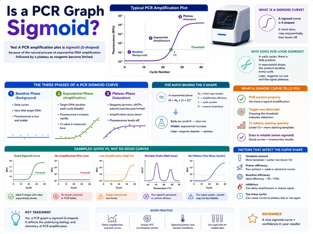
Is a PCR graph sigmoid?
A PCR graph is usually sigmoid when you are looking at a real-time PCR or qPCR amplification curve on a normal linear fluorescence scale. The curve starts flat, rises sharply as DNA copies build up, and then levels off when reagents become limited. That “S-shaped” pattern is the classic PCR amplification graph.
But the full answer is a little more personal for anyone staring at qPCR software and wondering whether their curve looks “right.” A good PCR graph is not just a pretty S. It should have a clean baseline, a clear exponential rise, and a plateau that makes biological and chemical sense. If one of those parts is missing, the graph may still show amplification, but it may also be warning you about low template, poor primer design, inhibition, background fluorescence, primer-dimers, or late-cycle noise.
Typical Sigmoid PCR Amplification Curve
A normal qPCR amplification graph starts with a flat baseline, rises sharply during the exponential phase, and then reaches a plateau.
A real-time PCR amplification graph is commonly sigmoid because fluorescence stays low at first, rises quickly during amplification, and then flattens as the reaction slows. This shape reflects how PCR product accumulates across repeated cycles.
In qPCR, the graph usually plots cycle number on the x-axis and fluorescence signal on the y-axis. The signal increases as more target DNA is made. Early cycles often look quiet because the fluorescence is too low to rise above background. Then the curve climbs as product becomes detectable. After many cycles, the curve stops rising at the same rate and forms a plateau.
That is why many qPCR curves look like an “S.”
The typical amplification curve is often described as having a baseline or linear ground phase, an exponential or log-linear phase, and a plateau phase. These phases are widely used when reading real-time PCR results and calculating Cq or Ct values.
Why does a PCR graph look S-shaped?
A PCR graph looks S-shaped because the reaction starts with too little DNA signal to see, then copies increase quickly, and later the reaction slows as primers, nucleotides, polymerase activity, and other reaction conditions become less favorable.
During the first cycles, amplification may already be happening, but the instrument mostly sees background fluorescence. The curve looks flat because the signal has not crossed a visible detection level.
Once enough amplicon has formed, fluorescence rises sharply. This is the part people care about most in qPCR, because the reaction is still behaving in a more predictable way.
Later, the reaction loses speed. Reagents are no longer present in the same excess. Product can compete with primers. Enzyme activity may drop. Fluorescence no longer rises in proportion to starting template. The curve flattens.
That three-part behavior gives the graph its sigmoid shape.
What are the main parts of a sigmoid PCR curve?
A sigmoid PCR curve has three main visual parts: the baseline, the exponential rise, and the plateau. Each part tells you something different about the reaction.
Three Main Phases of a qPCR Curve
The curve moves from a quiet baseline into a fast exponential rise, then flattens when the reaction reaches its late-cycle limit.
Baseline phase
The baseline phase is the flat early part of the PCR graph where fluorescence is close to background. The reaction may be making product, but the instrument cannot separate true amplification signal from background noise yet.
This part matters because qPCR software often uses early cycles to estimate background fluorescence. If the baseline is set badly, the whole curve can appear shifted, tilted, or noisy.
A clean baseline is usually low and stable. It should not drift upward strongly before true amplification begins. Sloping baselines can affect curve shape and Cq reading, so they should not be ignored in careful qPCR work.
Exponential phase
The exponential phase is the steep rising part of the PCR curve. This is where amplification is most useful for quantification because the amount of PCR product is closely tied to the amount of starting template.
In an ideal PCR reaction, DNA roughly doubles each cycle during the early efficient phase. Real reactions are rarely perfect, but this region is still the most reliable part of the curve for comparing samples.
The Cq or Ct value is usually taken where the fluorescence crosses a threshold within this rising region. A lower Cq usually means more starting target. A higher Cq usually means less starting target, assuming the assay is working properly.
Plateau phase
The plateau phase is the upper flat part of the PCR graph. The curve stops rising quickly because the reaction is no longer running with the same efficiency.
At this point, the fluorescence is high, but the data is less useful for measuring starting quantity. Two samples that began with different target amounts may end up at similar plateau heights. That is why qPCR is read in the earlier rising region, not at the final endpoint.
A plateau does not mean the sample had more target. It mostly means the reaction reached its late-cycle limit.
Does every PCR graph have a sigmoid shape?
No, not every PCR graph looks sigmoid. A clean qPCR amplification curve usually does, but the shape can change when the reaction is weak, inhibited, noisy, poorly designed, or viewed on a different graph scale.
Endpoint PCR is often checked on a gel rather than a real-time fluorescence graph. In that case, you may not see a sigmoid curve at all.
Digital PCR also uses a different readout style. It usually counts positive and negative partitions rather than reading one classic S-shaped amplification graph for quantification.
Even in qPCR, some curves are not textbook sigmoid. A curve may rise late, stay low, lack a plateau, look jagged, or show more than one signal pattern. Those shapes need careful reading before calling the result positive or negative.
Why does qPCR software sometimes show a curve that is not sigmoid?
qPCR software may show a non-sigmoid curve because the raw fluorescence data includes background, noise, dye behavior, baseline correction, and instrument processing. The curve you see is not always a pure picture of DNA doubling.
A few common reasons include:
- Low starting template
- Poor primer efficiency
- PCR inhibitors
- Evaporation or pipetting error
- Primer-dimer formation
- Wrong baseline settings
- Fluorescence drift
- Late nonspecific amplification
A curve that rises only at cycle 38 or 40 can be especially tricky. It may be true low-copy amplification, but it may also be background noise, primer-dimer, or contamination. The melt curve, no-template control, replicate behavior, and assay history become very useful here.
Is the exponential part of PCR sigmoid or exponential?
The full qPCR amplification curve is sigmoid, but the middle rising region is exponential. Both statements can be true because they describe different parts of the same graph.
On a normal linear fluorescence plot, the whole curve looks S-shaped.
On a semi-log plot, the exponential region may appear more like a straight line because the y-axis has been log-scaled. That straight-looking section is where amplification efficiency is often studied.
This is one reason PCR graphs can confuse beginners. The same reaction can look sigmoid on one scale and partly linear on another scale. The biology did not change. The graph display changed.
What does Ct or Cq mean on a sigmoid PCR graph?
Lower Ct vs Higher Ct on a PCR Graph
A sample with more starting target crosses the threshold earlier. A sample with less starting target crosses later.
Ct or Cq is the cycle number where the fluorescence signal crosses a set threshold above background. It is read from the rising part of the sigmoid curve, not from the flat baseline or the plateau.
Many people say Ct, while MIQE-style reporting often favors Cq because it is a broader term for quantification cycle. In practice, both are used in labs, software, papers, and technical documents.
A sample with more starting target crosses the threshold earlier. Its curve shifts left. A sample with less starting target crosses later. Its curve shifts right.
That left-or-right movement is more useful than the final height of the curve.
A Cq value depends on threshold placement, baseline correction, assay efficiency, and sample quality. The MIQE guidelines were created to make qPCR reporting more transparent and more consistent between labs.
Does a lower Ct mean a stronger sigmoid curve?
A lower Ct means the fluorescence crossed the threshold earlier, usually because the sample had more starting target. It does not automatically mean the curve is better.
A strong qPCR result should have both a reasonable Cq and a clean curve shape. A sample can cross early but still show abnormal behavior if there is contamination, nonspecific signal, or a baseline problem.
A good curve should rise smoothly, cross the threshold in the exponential region, and behave similarly across technical replicates.
If one replicate crosses at cycle 22 and another at cycle 29, the problem is not the sigmoid concept. The problem may be pipetting, sample mixing, inhibition, or low template randomness.
Is a late PCR curve still sigmoid?
A late PCR curve can still be sigmoid if it has a clear baseline, a smooth rise, and a plateau. The issue is that late amplification is harder to trust without controls.
Late curves often appear when starting template is very low. They may also appear because of primer-dimers, nonspecific products, or contamination.
In SYBR Green assays, the melt curve is very useful because SYBR binds double-stranded DNA in general. A clean single melt peak supports a specific product. Extra peaks or low-temperature peaks may suggest primer-dimers or nonspecific products.
Probe-based assays can be more specific, but they are not immune to poor amplification, inhibition, or background issues.
What does a normal sigmoid qPCR curve look like?
A normal sigmoid qPCR curve usually has a quiet baseline, a smooth and steep rise, and a clear plateau. Replicates should cluster close together when they contain the same amount of target.
The best curves do not look jagged. They do not rise before the baseline ends. They do not cross the threshold during a noisy region. They do not flatten too early.
A normal curve also makes sense next to the controls. The no-template control should stay flat. Positive controls should amplify in the expected range. Standards should show regular spacing across dilutions.
A curve is not judged alone. It is judged as part of the full run.
What does an abnormal PCR graph mean?
An abnormal PCR graph means the reaction signal does not follow the expected baseline-rise-plateau pattern. The cause may be technical, chemical, biological, or software-related.
Normal Curve vs Abnormal PCR Curves
Abnormal PCR curves may stay flat, rise late, drift upward, or look noisy compared with a clean sigmoid curve.
Flat curve
A flat curve usually means no detectable amplification. The target may be absent, the template may be degraded, or the reaction may have failed.
Flat curves in no-template controls are good. Flat curves in positive samples are not.
If the positive control is also flat, the issue may be master mix, cycling conditions, primers, probe, enzyme, or instrument setup.
Noisy baseline
A noisy baseline can make Cq values unreliable. It may come from bubbles, poor plate sealing, dirty wells, evaporation, low dye stability, or software baseline settings.
Small noise early in the run is common. Large noise that crosses the threshold can create false calls.
Curve rises but never plateaus
A curve that rises without a clear plateau may appear when amplification is weak, cycle number is too low, template is very low, or reaction efficiency is poor.
It may still be usable in some cases if the exponential region is clean and controls support it, but the result should be read carefully.
Curve appears too early
A curve that appears very early may mean a high target load. It can also point to contamination or too much template.
Very early Cq values should be checked against expected biology, dilution records, controls, and sample handling.
Multiple curves in controls
Amplification in a no-template control is a warning sign. It may mean contamination or primer-dimer signal.
In SYBR assays, a melt curve can help separate true target from nonspecific products. In probe assays, contamination still needs to be taken seriously.
Is the melt curve also sigmoid?
Amplification Curve vs Melt Curve
The amplification curve tracks fluorescence across PCR cycles. The melt curve tracks signal change across temperature.
No, a melt curve is not the same as a sigmoid amplification curve. A melt curve shows how double-stranded DNA separates as temperature increases after PCR.
The amplification curve tracks fluorescence across cycles.
The melt curve tracks fluorescence across temperature.
In SYBR Green qPCR, the melt curve helps check whether the amplified product is specific. A single clean peak often supports one main product. Multiple peaks can suggest nonspecific amplification. A small lower-temperature peak often points toward primer-dimers.
So, the PCR amplification graph may be sigmoid, while the melt curve is a different graph with a different purpose.
Why does the PCR graph plateau?
The PCR graph plateaus because amplification becomes less efficient late in the reaction. Reagents are no longer in ideal excess, enzyme performance can drop, product concentration is high, and reaction conditions no longer support the same doubling pattern.
This plateau is normal.
The mistake is treating plateau height as a direct measure of starting DNA. It is not. qPCR quantification depends on when the curve crosses the threshold, not where the curve ends.
A high plateau does not always mean more starting template. A lower plateau does not always mean less starting template. Dye chemistry, probe behavior, reaction volume, instrument settings, and assay design can all affect final fluorescence.
Can PCR efficiency change the sigmoid shape?
Yes, PCR efficiency can change the slope and timing of the sigmoid curve. A high-efficiency reaction rises steeply. A low-efficiency reaction rises more slowly and may cross the threshold later.
PCR Efficiency Changes the Curve Slope
A high-efficiency reaction rises steeply. A lower-efficiency reaction rises more slowly and may cross the threshold later.
Efficiency is often checked with a dilution series. A well-behaved qPCR assay should give predictable Cq spacing across known dilutions.
If efficiency is poor, the curve may still look sigmoid, but the quantification may be weak. Primer design, amplicon length, inhibitors, annealing temperature, magnesium concentration, and template quality can all play a role.
Real-time PCR efficiency is closely tied to the exponential phase, where reagents are still available and amplification is more consistent.
Is a sigmoid PCR graph enough to prove the result is correct?
No, a sigmoid curve alone is not enough to prove the PCR result is correct. It is a good sign, but it must match controls, replicate behavior, melt curve or probe specificity, and expected Cq range.
A false positive can still make a curve.
A contaminated no-template control can make a curve.
Primer-dimers can make a curve in SYBR assays.
A true result needs the curve shape and the full experiment to agree.
Good qPCR reading is a pattern-recognition task. The curve is part of the evidence, not the whole answer.
How should you describe a PCR sigmoid curve in simple words?
A PCR sigmoid curve is an S-shaped amplification graph seen in real-time PCR. It begins with a flat baseline, rises sharply when amplified DNA becomes detectable, and then levels off as the reaction reaches its limit.
That sentence is simple, accurate, and easy to use in a lab report, blog post, or teaching article.
A slightly more technical version would be:
A qPCR amplification curve is typically sigmoid on a linear fluorescence plot because the reaction passes through baseline, exponential, and plateau phases as product accumulates over repeated PCR cycles.
What should you check before trusting a sigmoid PCR graph?
Standard Dilution Series and Ct Spacing
In a clean dilution series, lower template amounts cross the threshold later in a regular pattern.
A sigmoid curve is easier to trust when the run has good controls, clean replicates, and a threshold placed in the exponential region.
Check whether the no-template control stayed flat. Check whether the positive control amplified where expected. Look at replicate spacing. Review the melt curve if using SYBR Green. Make sure the threshold is not cutting through baseline noise or late plateau signal.
Also look at the raw curve if the software allows it. Processed curves can hide baseline issues.
A beautiful S-shaped curve can still be wrong if the product is nonspecific. A messy curve can sometimes be explained by a simple technical issue. The best answer comes from reading the graph and the experiment together.
A PCR graph is sigmoid, but the shape is only the beginning
A real-time PCR graph is usually sigmoid, and that S-shape is one of the first things people learn to recognize in qPCR. It tells you the reaction moved from low background signal into measurable amplification and then into a late plateau.
The stronger skill is learning what the curve is trying to say.
A clean sigmoid curve can give confidence. A shifted curve can point to different starting amounts. A noisy, late, or oddly shaped curve can warn you before a bad result enters your data. Once you can read the baseline, rise, threshold, and plateau together, the PCR graph becomes less like a confusing software output and more like a story of what happened inside the tube.